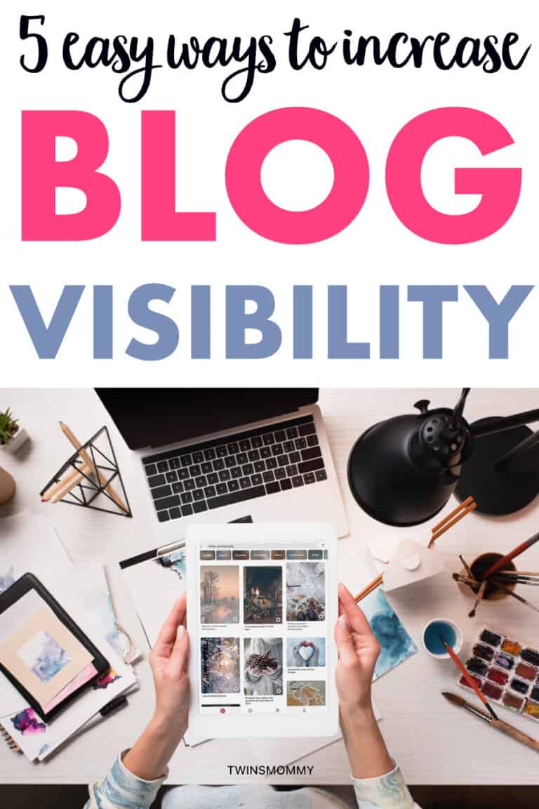
Do you want to increase the visibility of your blog?
Do you cringe every time you have to login to your WordPress dashboard, knowing you need to update your blog?
But, you end up telling yourself you either don’t have the time or it’s just too overwhelming?
You end up putting “improve blog” at the bottom of your to-do list and hope what little traffic you do have doesn’t suddenly take a hiatus.
Well, let’s be real here –
If you share your blog on Pinterest, then pinners are going to see your blog and boy oh boy, do they want a visually appealing blog!
So, instead of putting increase visibility of your WordPress blog at the back burner, it’s time to bring it upfront and actually work on it.
Could Your Blog Be Doing More for You?
Go on. Admit it.
You love your blog, but you don’t want to admit it needs an overhaul, so, you let the feeling that your blog’s missing something consume you.
You conclude it has to be your content so you work harder than ever before to provide the best tips, stories and advice your readers have ever seen.
But, if your blog is hard to navigate, slow to load and doesn’t make it easy to share, what good is your blog anyways?
At this point in the game, people are leaving your blog before they’ve even had a chance to invest in your content.
If this is happening to you, maybe it’s time to improve your blog. Don’t leave it to the last “to-do” item on your list; pick today to change your blog for the better.
Here are six things you can do on your blog to make a better experience for your readers – getting you more engagement.
Clean Up Your Look With a Modern WordPress Theme
Are you still rolling with the default WordPress theme that came pre-installed on your blog?
Maybe you’re using a different theme, but it’s five years old and has the telltale signs that it’s dated:
- Difficult Navigation – The menu is hard to find or use, making it challenging to navigate your site.
- Comic Sans font – that favorite, crazy font from back in the day
- Scrolling text – Your blog isn’t a news network
A good gauge to see if you need a new WordPress theme is to look at your blog from a different device like an iPad, Galaxy phone or other smartphone.
Can you see everything? Does everything load fast? Can you navigate the site easily?
To give your blog a facelift, opt for a modern WP theme with a minimalist design.
A minimalistic theme is typically free of clutter and free of poor design elements.
So, how can you give your readers the best user experience on your blog?
Here are some web design trends that can level up your blog.
Flat Designs
Designers are retiring the hyped look and leaning towards more flat-looking designs.
Many businesses like Microsoft – who many feel are responsible for starting the flat-design trend – use flat images in their overall web design layouts.
Flat designs are seen in illustrations, icons, social sharing buttons, images and more.
Here’s a little tip: You may not be ready to fully commit to a flat redesign, but to add a little “modern flatness” to your site, take a look at Genericons or IcoMoon where you can download sets of flat icon fonts for free.
Sticky Navigation
Ever been to a web page where the menu followed you as you scrolled? That’s a sticky navigation menu.
Many WordPress themes contain this design element making navigating a site quicker and easier for the user.
While having a sticky menu is good for ease of usability, it does not fare well for mobile users. Having some 40-odd pixels devoted to a static menu isn’t the best use of space on an already-tiny viewport.
As a compromise, there are WordPress themes available that – when you scroll – either shrink the navigation bar or have the menu disappear with a hamburger icon in its place.
Parallax Scrolling
Parallax scrolling causes a neat visual effect when you scroll – the site’s background moves slower than the foreground.
And with the pressing need to go mobile-friendly, parallax scrolling is much easier to maneuver on a smartphone than clicking.
It creates a fun and memorable user experience and is a sure-fire way to tweak your blog. But don’t feel you have to have something like this to gain more traffic to your blog!
Make Your Blog Searchable
If you new to blogging, it’s important to start making your blog searchable.
You do this by using SEO or search engine optimization.
First things first, SEO is all about helping your blog get noticed by search engines like Google.
It’s like giving your blog a little nudge and saying, “Hey, look over here!”
When you use SEO, you’re increasing the chances of your blog popping up when someone searches for a topic you’ve written about.
So, how do you start?
These are the words or phrases that people type into search engines when they’re looking for something.
Your mission is to sprinkle these keywords throughout your blog posts in a natural, reader-friendly way.
But don’t go overboard – you want your posts to still sound like you!
Next up, let’s talk about titles and headings.
These are super important for SEO. Make sure your blog post titles and headings are clear, catchy, and include your main keywords.
This helps search engines understand what your post is about and can boost your visibility.
Don’t forget about your blog’s overall structure and navigation.
A well-organized blog with easy-to-navigate menus and clear categories is like a dream for search engines.
It makes it easier for them to crawl your site and index your content, which means better visibility for you.
And last but not least, let’s chat about links.
Internal links (links that go to other parts of your own blog) and external links (links that go to other websites) are great for SEO.
They help search engines understand the relevance and authority of your content. Plus, they can keep your readers engaged and exploring your blog for longer.
Create a Call-to-Action Below Your Blog Post
If you don’t already have one, a call-to-action (CTA) is a good way to build your email list, grow your traffic and promote your products.
As a blogger, you want to capture your readers with your engaging content and if they enjoy it, they are more likely to subscribe to your email list.
You can do this effectively with a CTA at the bottom of each blog post.
All the big bloggers do this, including Adam.
When deciding how to customize your CTA box:
- Make it obvious. If your CTA blends in with your blog, no one will notice it. Instead, make it contrasting so it stands out.
- Make your button copy sell. Phrases such as, “click here,” “buy now” or “sign up” have a weaker impact on conversion. It’s best to use “me” in your button copy like, “Sign me up.”
- Place your CTA on other pages. Place a CTA on your home page, “about page” and resources page to maximize your conversion rate as well as make it easy for your readers to subscribe.
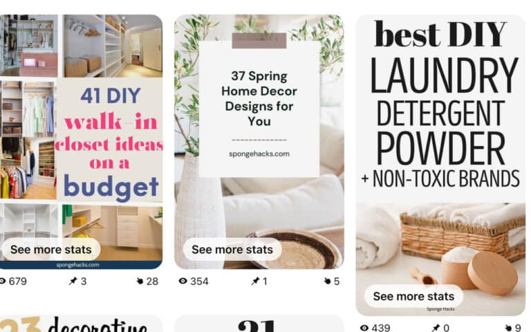
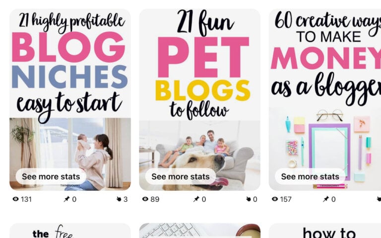
Include a Pin-Worthy Image
Pinterest is growing in popularity and is one of the top referrals for many bloggers – especially ones in the food, hobby and DIY niche.
Now is the time to jump on the “Pin” bandwagon and tap into a new demographic of users.
This particular online audience gobbles up striking images – and with a little tweaking – you can have a pin-worthy image too. Here are 3 tips to get you started:
Make Your Images Tall and Taller
Pinterest uses a vertically shaped image rather than the traditional horizontal shaped image other social media sites prefer.
While there isn’t a general consensus on the optimal image size to use, a good rule of thumb is having an aspect ratio between 2:3 and 4:5.
But, don’t just make one size of tall pins, play around with even taller sizes.
Don’t Forget Keywords
It’s important that your Pin title has keywords in it. You can search for the keyword in Pinterest Trends or in the drop down menu.
Find a keyword and then check to see if your pin already ranks for that. If it doesn’t then go ahed and use it but if your pin or or one of your pins is ranking for that keyword, find another one.
Avoid Faces
Finally, don’t use faces!
There, I said it. Lately, Pinterest has been suppressing Pins with kids and faces so it’s a good idea to avoid them altogether.
But, what if you have a lifestyle blog? What do you do then?
Well, it’s best to have pins with people’s backside or side. I use faces in my feature image and pin designs still but I’m working on being more conscious of it.
If you need more help on Pinterest and gaining more traffic from it, check out my eBook, 15 Genius Pinterest Secrets for Bloggers.
Boost Your Repins With These Tweaks
To make your image shine on Pinterest and grab the interest of readers, try these tweaks:
- Use vibrant colors that take up most of the picture. Images with less than 30% whitespace received more repins than those that had fewer colors and more white space.
- Use light images. Using light images rather than dark ones account for 20x more repins.
- Support your image with text. Free image editors such as Canva make it easy to customize your image with text. This makes it much easier for pinners to see immediately what your pin is about – making your pin visually eye-catching on Pinterest’s feed.
- Brand your image with your blog’s URL. By placing your logo or just a text box with your URL on your image, you’re expanding your brand’s reach while protecting yourself from other people “borrowing” your content.
No More Pop-Ups
You know those pesky pop-ups and exit intents that seem to be all over some blogs?
Yeah, those.
While they might seem like a good idea to grab attention or boost conversions, having too many can actually do more harm than good.
It’s confusing, annoying, and definitely not the best user experience.
Now, don’t get me wrong.
I’m all for finding ways to monetize your blog with ads or grow your email list.
But there’s a fine line between being helpful and being downright intrusive.
When a reader lands on your blog, they’re there for your content, your stories, and your advice.
The last thing they want is to be bombarded with pop-ups before they’ve even had a chance to read a sentence!
So, what’s the solution?
Balance!
It’s totally okay to have ads or opt-in forms on your blog.
But instead of having them pop up left, right, and center, why not position them more strategically?
For example, you can incorporate them within your blog post.
This way, they feel like a natural part of the content and are less likely to distract or annoy your readers.
And if you do decide to use pop-ups or exit intents, use them sparingly.
Make sure they’re relevant to your content and offer real value to your readers. A well-timed, well-crafted pop-up can be effective without being overbearing.
Remember, the key to a successful blog is keeping your readers happy and engaged.
By reducing the number of pop-ups and focusing on providing a seamless user experience, you’ll not only keep your readers coming back for more, but you’ll also build trust and credibility in the blogging world.
Over to You
Blogging isn’t easy.
It’s an enormous commitment for you and a lot of work has to go into your blog to make it a success.
What you do on your blog and how you design it is ultimately your choice.
These tips, though, can help you create a user-friendly blog. Readers will want to stick around, engage with your site, and most importantly – come back in anticipation of your next post.
Now, it’s your turn – what’s one thing you want to make over on your blog?


Leave a Reply