List Building

How to Optimize Your Blog to Increase Your Email Subscribers

I know.

You just started a blog, and not only do you have to know how to manage your blog and how to promote your blog, but you also need to know how to increase your email subscribers.
How to Optimize Your Blog to Increase Your Email Subscribers

Because let’s face it:

If you want to monetize your blog, you’re going to NEED an email list. This isn’t some list where you email your subscribers funny stories that happened to you over the weekend or the best finds you had while shopping.

No.

Your email list is a marketing email list – yes, mama bloggers, it’s true. Don’t shudder.

But, what if you only use your email list to update your subscribers about your business or what’s on your blog?

That’s still considered a marketing email because you’re building a relationship with bloggers that want to learn from you. And since you want to make an income online, anything you create in the future your subscribers will like and buy.

So, it’s in the best interest for you to start an email list as soon as you start your blog. I had an email list around a month into starting Twins Mommy.

Since it was a new blog, I had to find ways to capture visitors’ email addresses once they started reading my posts. But, can you have too many opt-in forms on your site?

The answer is no. You can’t have too many places on your blog for people to sign up. In fact, the MORE places you have, the more subscribers you’ll get.

Makes sense, right?

The Worst Place for Your Opt-In Form

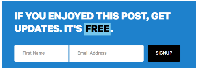
If you’re unsure what I mean when I say opt-in form – it’s the place where people put their name and email address to receive your notifications.

Here’s an example from Social Triggers:
screen-shot-2016-10-04-at-10-21-03-pm

There are lots of ways to present it (with a pop-up, exit intent, slider, welcome mat), but for the simplicity of this post and to not overwhelm a new mama blogger, I’m going to talk about where to place your opt-in form.

But first, let me tell you the worst place. Can you take a guess?

It’s your sidebar.

I’m so sorry if your opt-in form is there! But, if your form is under your bio on your sidebar or before your popular posts, it won’t convert that well – or at all.

Why? Because of banner blindness. Yes, it’s a real thing (like analysis paralysis!).

Banner blindness resulted from looking how people’s eyes tracked online content. Our eyes usually follow in an F shape when we read something online.

People overlook the sidebar.

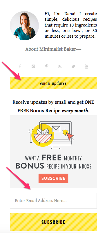
But, in saying that, it doesn’t mean you CAN’T put an opt-in form on your sidebar. I mean, look at the Dana from the Minimalist Baker:
screen_shot_2016-10-04_at_10_33_28_pm

She has not one, but two opt-in forms on her sidebar. Her blog brings over 3 million visitors a month! So, Dana can do whatever she wants girl!

So, even if this is considered the worst place for your email opt-in form, it is a classic place on your blog and if you have enough traffic, go ahead and put one, two or three forms on your sidebar 🙂

But, if you’re growing your blog and don’t have a ton of traffic, here are eight highly converting places to put your email opt-in form.

1. Your About Page

Every blog has some form of an About page. And you know what? It’s one of the most visited pages on your blog.

Why? Because if visitors just landed on your blog, read your post, liked your post, they want to now who you are. The About page helps them find out more about the blog and the blogger.

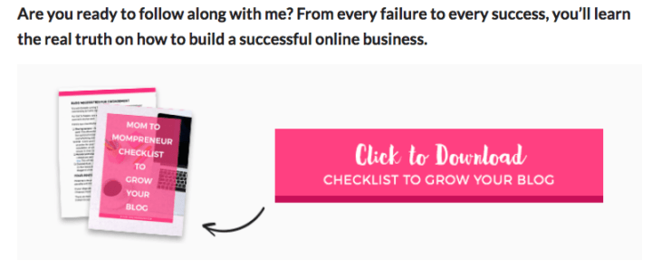
And one way to make sure you capture these first-time visitors is with a call-to-action at the end of your About page.

This is something you want the reader to do. And well, why not have them sign up to your email list? That’s a good call-to-action!

This is something I have done on my About page:
screen-shot-2016-10-04-at-10-46-34-pm

2. Your Header

A great way to make sure your visitors know you have an email list is to place your opt-in form in the header of your blog.

It’s practically one of the first things visitors see when they come to your site. A lot of bloggers use this spot to market their lead magnet – their main freebie they are offering.

For example, Cath from Catherine Oneissy offers a Pinterest quiz as her freebie:
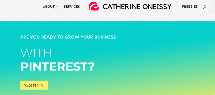
BAM! It’s easy to see it eh?

3. On a Landing Page

Landing pages are getting in the marketer and small business territory here. But, more and more bloggers are using landing pages to help them grow their email list.

A landing page is a page on your site that is free of distractions. Usually, there are only two options you can choose from – to subscribe or not/read the blog.

It’s a highly converting page for bloggers since it limits the choices a visitor has – subscribe or don’t.

Landing pages don’t have to be your home page. You can create landing pages on your site, and nobody would see them unless they see your pin on Pinterest or tweet on Twitter.

Here’s an example of a landing page from Brianna from Momma Works Too:

screen-shot-2016-10-04-at-10-51-45-pm

She set this page to come up as you’re leaving, and it’s a great way to capture people who are going to bounce from your site.

4. Your Author Bio

Do you have an author bio at the end of your blog posts? You should. One of my pet peeves when I visit a blog is I have no idea what your name is!

Your bio says, “Hi I’m a mom to two precocious girls, and I love to cook.” And sometimes, when I try to find your name when you comment, you don’t use your name there either!

I digress 🙂

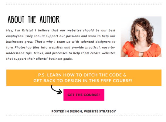
One way to make sure people know who you are is to put an author bio at the end of each post. This is also a great way to market your freebie when people sign up to your blog. Not a lot of bloggers do this, so you can be one of the first in your niche!

A great example is Krista Rae (don’t you L-O-V-E her blog’s design and brand?). She totally gets the call-to-action with her bio. She makes it known that she wants people to sign up to her design course.
screen-shot-2016-10-04-at-11-12-49-pm

5. Your Navigation Menu

And of course, another way to market your email list is to put a link in your navigation menu. People like using menus, and it won’t go out of fashion any time soon.

So, go ahead and create a link to help people direct them to your email list. Sarah of The Frugal Millionaire does a great job of doing this with her menu. She has a link called Freebies where you can go and check out what she has to offer.

You pick one topic, go to her landing page and sign up to receive that report.

6. Your Top Bar

What the heck is your top bar? It’s the top top bar of your site (of course!..). Here’s mine:

screen_shot_2016-10-05_at_2_56_59_pm

Well, a great spot to advertise your email list is there. You can use Hello Bar or the SumoMe Smart Bar for your site.

Not only can you advertise your lead magnet, but a great usage of that spot is to promote future webinars.

Miranda Nahmias uses that spot to tell everyone of her upcoming webinar about using video on your blog.screen-shot-2016-10-05-at-3-11-08-pm

If you’re not sure whether a top bar would look nice on your site, Hello Bar offers a free demo. Give it a try!

7. Your Footer

Your footer is unused space at the bottom of your site. Why not make use of it and place your email opt-in form there?

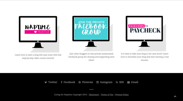
I know I don’t make use of my footer on any of my sites. Not only is it a great spot promote your list, but you can promote courses, facebook groups, and popular blog posts.

Here’s Chyrstie of Living For Naptime and her footer.
screen-shot-2016-10-05-at-3-17-49-pm

How perfect is that?

Love it!

You can create a graphic on Canva or PicMonkey and then link your image to your sign up form or a landing page!

8. In Your Blog Post

One of the best ways to grow your email list is to use content upgrades.  These are post-specific freebies you offer to your readers in exchange for their email address.

It works like this:

They land on your post from Pinterest.

They are reading your post and BAM! They see you have a supplemental guide based on the blog post they are reading.

They sign up.

New subscriber! Yay!

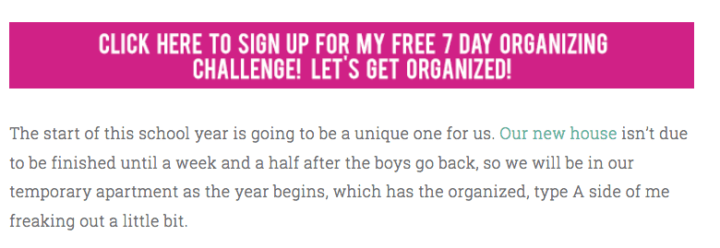
You can create any graphic you want. Abby from Just a Girl and Her Blog uses a colored box that links to her landing page for her content upgrade. She says doing it this way (directing visitors to a landing page) is much more effective to growing her list than having a pop-up appear).
screen-shot-2016-10-05-at-3-27-41-pm

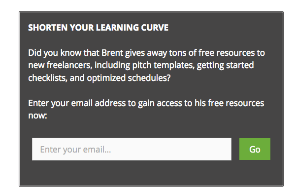
Now, you don’t have to be super fancy with your content upgrades. If you want, you can just place a subscription box within your blog post like what Brent Jones does.
screen-shot-2016-10-05-at-3-23-18-pm

You never know! If your blurb is enticing, you can convince visitors to sign up to your list!

Time for Your Blog to Help You Grow Your Email List

There ya go!

Eight high-converting ways to optimize your blog to grow your email list. There are never too many spots to promote your list. You can have many different freebies or lead magnets on your site so don’t be afraid of creating them and promoting them!

We are all mompreneurs or mompreneurs in the making! Email is where it’s at if you want to monetize your blog and build a tribe.

Over to you – tell me where you place your sign up forms on your blog!

Leave a Reply

55 Comments

Mine is on my sidebar, but also at the end of every post, and on my About. Thanks for the nudge to change things up!Reply to Lorna
Thank you so much for this post Elna. I’ve applied it everyone on my site but the nav bar. Will be doing that once I finish putting up two more freebies. Thanks again!Reply to Sana
Hi Sana, That’s great. Give it a try and see if that helps increasing your subscribers with list building!Reply to Elna
Again, you did it Elna ! Love this post. Now if I can just create a freebie. I cannot think of any for the life of me. I started a health and wellness blog. I don’t do recipes or exercises so, just inspiring info on keeping healthy such as managing anxiety etc. How do I create a freebie around that theme? anyway, keep doing what you do. You inspire.Reply to Jane
Hi Jane! Thank you so much! As for your freebie idea, make sure it’s a quick win. Maybe a week’s worth of exercises to get your bod ready for the summer? You can target moms even if that is your audience. Or video tutorials on how to do home exercises?Reply to Elna
Because of the theme I’ve got, the sidebar only displays on the main blog page, so I do have an opt-in there, but then I use embedded forms within the blog posts (right below the relevant part of the post) and I use exit-intent popups. And I’ve got a huge opt-in option in the header!Reply to LJ
Hey LJ, Those are awesome tips! Yes exit intent are awesome as well as below the post or on the post! Great job growing your email list!Reply to Elna
Nice post full of great tips… as always. 😉 I do most of these things. The only thing I need to do is start creating more freebies! But who has the time???Reply to Lorraine
Hey Lorraine, Yes, I know what you mean. I haven’t created a new freebie for months now! It’s a challenge for sure!Reply to Elna
Great info, Elna (as always)! Right now I ONLY have a landing page, but I’ve managed to collect subscribers from it and my blog isn’t even live yet! I’m pinning and I’ll be coming back to this post when I’m live!Reply to Brenda
Hi Brenda! Wow that’s amazing! I never used that approach but it makes total sense! Good luck and I can’t wait to see your new posts.Reply to Elna
These are all really fantastic tips! I’m going to have to go back and optimize my blog to get email subscribers now 🙂Reply to Cole
Hi Cole! You’re welcome! Yes, optimizing your blog for email subscribers is something I’m always learning and doing!Reply to Elna
I’m so sorry; I didn’t proofread and I misspelled your name. I know you’re Elna!Reply to Charissa
Ha, no problem! I fixed it for you 🙂 And yes, I ALWAYS need sleep…Reply to Elna
Or maybe I didn’t….I need sleep!Reply to Charissa
Hi, Elna! Awesome advice! Can I ask a couple questions: is the author bio a plugin? and how do you create a landing page? Thanks for all you do!Reply to Charissa
Hi Charissa, Yes the author bio is a plugin! As for a landing page, I know ConvertKit can make landing pages easily!Reply to Elna
Is that what the plug in is called?? Author bio?? If not, what plug in do you use?? ThanksReply to Anne
Hi Anne, I don’t remember which WP plugin I used, but here’s a roundup of popular ones: https://www.sitepoint.com/11-of-the-best-wordpress-author-bio-plugins/Reply to Elna
I love ALL the tips and your blog! I’m so happy I found it. 🙂 I’m thinking the whole blogging thing isn’t for me though. I have been working hard on my blog for a little over 4 months and not one comment. Maybe my content is just regular mom stuff that is not appealing to others. No big deal. 🙂 I love your blog though! Keep up the great work 🙂Reply to Courtney
Hey Courtney, I feel ya! The best way is to promote your blog 🙂 That was the ONLY way I got comments. I promoted it on FB and Pinterest and BOOM, people came, read, commented and shared 🙂Reply to Elna
Elna first thank you for including me in your post! I am honored! Now if I could figure out how to get my “Free Reports” nav menu pink. One thing at a time right?! I really love this list and will be using it. I especially like the idea of putting it in my footer and in my bio sidebar. Great tips! Thanks again for featuring me!Reply to Jen
Hey Jen! I love your blog and your landing pages. You have so many great tips on all of that 🙂 And of course I would mention you 😉Reply to Elna
I just love your stuff, Elna! I have gotten so many great tips from you! This post is no exception – I gleaned some new ideas of places to put my opt-in form. Thank you!Reply to Lisa
Hey Lisa! Aww! Thanks so much. I’m so happy when I hear from readers the love my content and it’s helping them grow their blog. Thank you so much.Reply to Elna
Great tips!Reply to Kim
I agree so much with not having your opt-in only in the sidebar. With so many people using cell phones, that area is the last thing shown. They have to page through the whole post, all ads and comments, then it starts with the side bar. No one stays that long. Right now, I have one there but also a pop-up which doesn’t come up for about 1 minute. I hate the ones that pop up before I even have seen the page!Reply to Kim
Hey Kim, I totally agree with the pop-up showing up too early. It totally turns me off and I immediately close it out. That’s why I like the exit intent. I use it on my Elna Cain site and ONLY on blog posts. That’s another pet peeve. I’m reading your About page or Contact page and then boom! A pop-up to join your list! Grr… there are classier ways 🙂Reply to Elna
This is SO helpful! I’m not a mommy blogger, but these are great tips for all of us! 🙂 xx http://theblondechiffon.comReply to Holly
Hey Holly! Thanks so much for stopping by. Glad you liked my post 🙂 Good luck growing your email list.Reply to Elna
I am so lost when it comes to this! This is just great, helpful information. I did not realize all you can do and now you really have my wheels turning! Thank you!Reply to Brittany
Hey Brittany, You’re welcome and I know what you mean. Growing your email list can be a challenge for a lot of people. So happy to hear that this post got you thinking!Reply to Elna
I have my email subscription box in my sidebar and in my footer. I might go pull it from the sidebar after this. 🙂 Thank you for the advice!Reply to Rebecca
Hey Rebecca! Kudos for you! That’s great. Good luck with getting more subscribers 🙂Reply to Elna
Wow! I thought I had read everything on how to build in sign up links on a blog… but this has got me thinking…! A really comprehensive post – glad I had a read and have bookmarked for the future 🙂 Love Becca Mental health and lifestyle blogger ~ based in Sheffield, UK http://www.mytwoblackdogs.comReply to Becca
Hey Becca! Wow! What a nice comment 🙂 I’m humbled by that remark. I’m so glad you found some great tips on how to optimize your blog for subscribers. I know I should use all of these! I actually do but on different various blogs. All are highly effective 🙂 Good luck.Reply to Elna
Great post Elna. I’ve been thinking about putting a opt-in form in my header but the thing is my theme doesn’t support a clickable header and doesn’t have any header widget area. I don’t really want to change theme. Anyone know if there’s a header widget plugin (I can’t find one), or any other way round this?Reply to Joanna
Hi Joanna, Thanks so much for stopping by! As for your header problem, since I don’t know the inter workings of your theme, I can only direct you to a post on some free header plugins. Good luck! http://www.wpexplorer.com/sticky-header-plugins-wordpress/Reply to Elna
Someday I’ll understand how to do all these. In the meantime, I think I can manage that bio at the end and making better use of the footer. Also, the contact page. So that’s a lot more than I’m doing now! Thanks! 🙂Reply to Katharine
Hey Katherine! Good luck! Yes, the author bio is the easiest as long as you have a page on your site with your sign up form. Contact page is a good one! Thanks for the tip!Reply to Elna
Great tips, Elna! I’m totally going to try that landing page as people leave – so quick and smart.Reply to Carrie
Hey Carrie, That’s great. Good luck with your landing page. I know I need to start a landing page on one of my blogs. Don’t know why I don’t have on though? I know they work for getting subscribers.Reply to Elna
That’s a great article! I’m in the process of moving my old blogspot content over my new hosted site! Wahoo! The next step is making my freemiums and starting an email list. I was worried about having too many spots or not knowing where to put them. But this is great! And different things grab different people. Thanks for the tips!Reply to Charisse
Hey Charisse! That’s great girl! Good luck on moving your blog to a hosted site! And good luck on getting your email up and running 🙂Reply to Elna
Great tips, thanks for sharing Elna! Bright colorful signups really do catch people’s attention.Reply to Jen
Hey Jen! Thanks so much. Yes, you can put sign ups on a lot of places on your blog eh?Reply to Elna
Great tips once again! Thanks for all your info. 🙂Reply to Callie
Hey Callie! Glad you liked the post and found some ways to optimize your blog!Reply to Elna
This is brilliant!! I am saving this for when I am actually at a computer!!!Reply to Emily
Ha! You’re welcome!Reply to Elna
It’s so funny how things change! It used to be highly recommended that you put your opt-in form in your sidebar and you never really heard about placing it anywhere else. Now, I can totally see the error in that! I have my opt-in form just beneath my header and it displays on every single page. I need to consider extra places too though, like in the author bio since you don’t see the form anymore when you scroll down.Reply to Kecia
Hey Kecia! Yeah, sorry. I don’t mean to offend other bloggers. It’s just that everyone puts it there and people just don’t “see” your side bar. I still use my side bar to promote things so, you know 🙂 That’s great you’re going to optimize your blog.Reply to Elna
Hey Elna! Thanks for featuring my opt-in 🙂 I’m thinking about changing it up soon… if I ever finish my lead magnet that is. I love your examples – I especially like Krista Rae’s site, her footer is pretty spectactular too. I’ve tried re-jigging mine to be a bit more functional. Still needs a bit of work though.Reply to Cath
Hey Cath! You’re welcome 🙂 Can’t wait to see your new lead magnet! Yes Krista’s site is awesome. She changed it up since the last time I was on her blog and it’s even better! Thanks for stopping by.Reply to Elna